
Conference mobile app
This app helps conference attendees to get the most out of their experience and help focus on what really matters - professional development
and networking.
Timeline
6 weeks
Deliverable
Mobile app
Role
UX Designer
UX Researcher
Platform
Figma
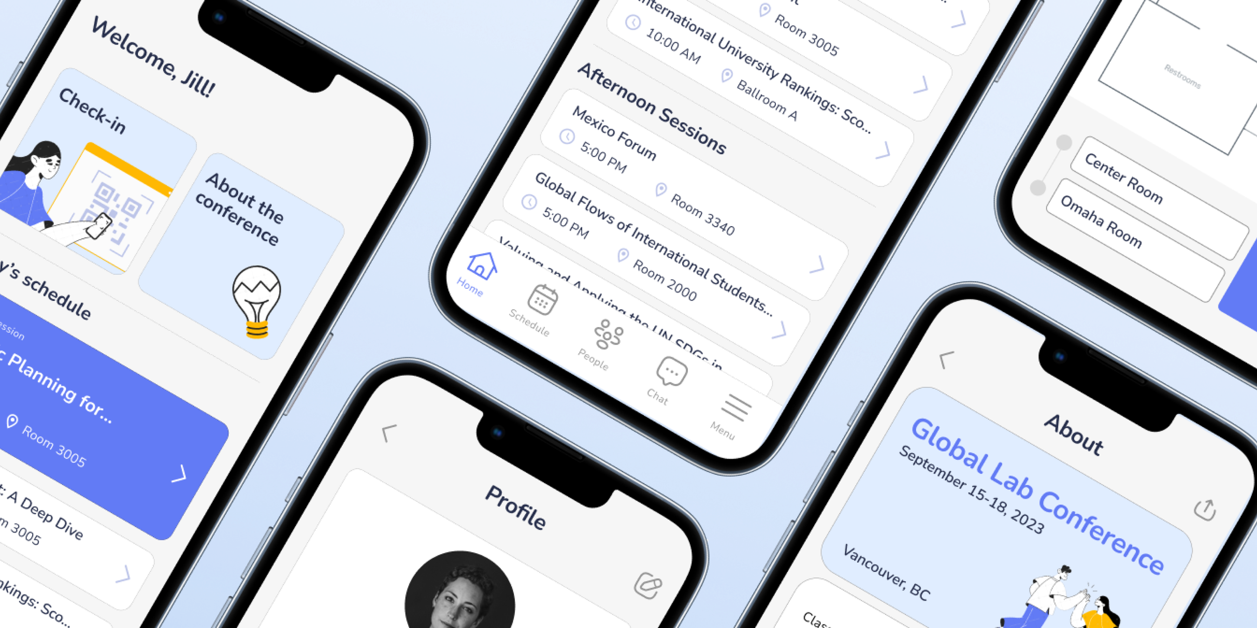
Maximizing conference experience
Context
I organized an international education conference and had to deal with lots of questions from the visitors. They felt lost and frustrated while trying to find a room, choose between concurrent sessions or look for a specific person. Much of this could be resolved with a simple interactive information tool - a mobile app.
Problem
There are lots of sessions, so much time and effort are spent trying to find the right room or figure out what session to attend.
Goal
Deliver smooth conference experience by keeping attendees informed, engaged and connected.

Solution
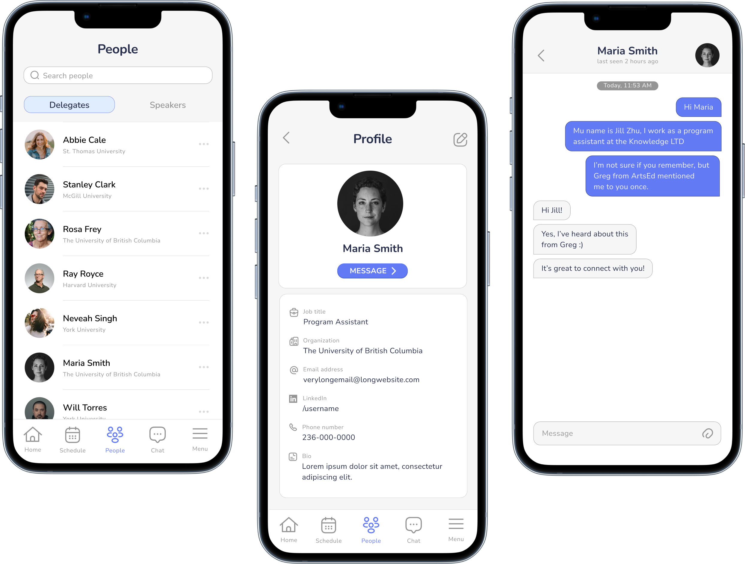
Easily find people and make new professional connections

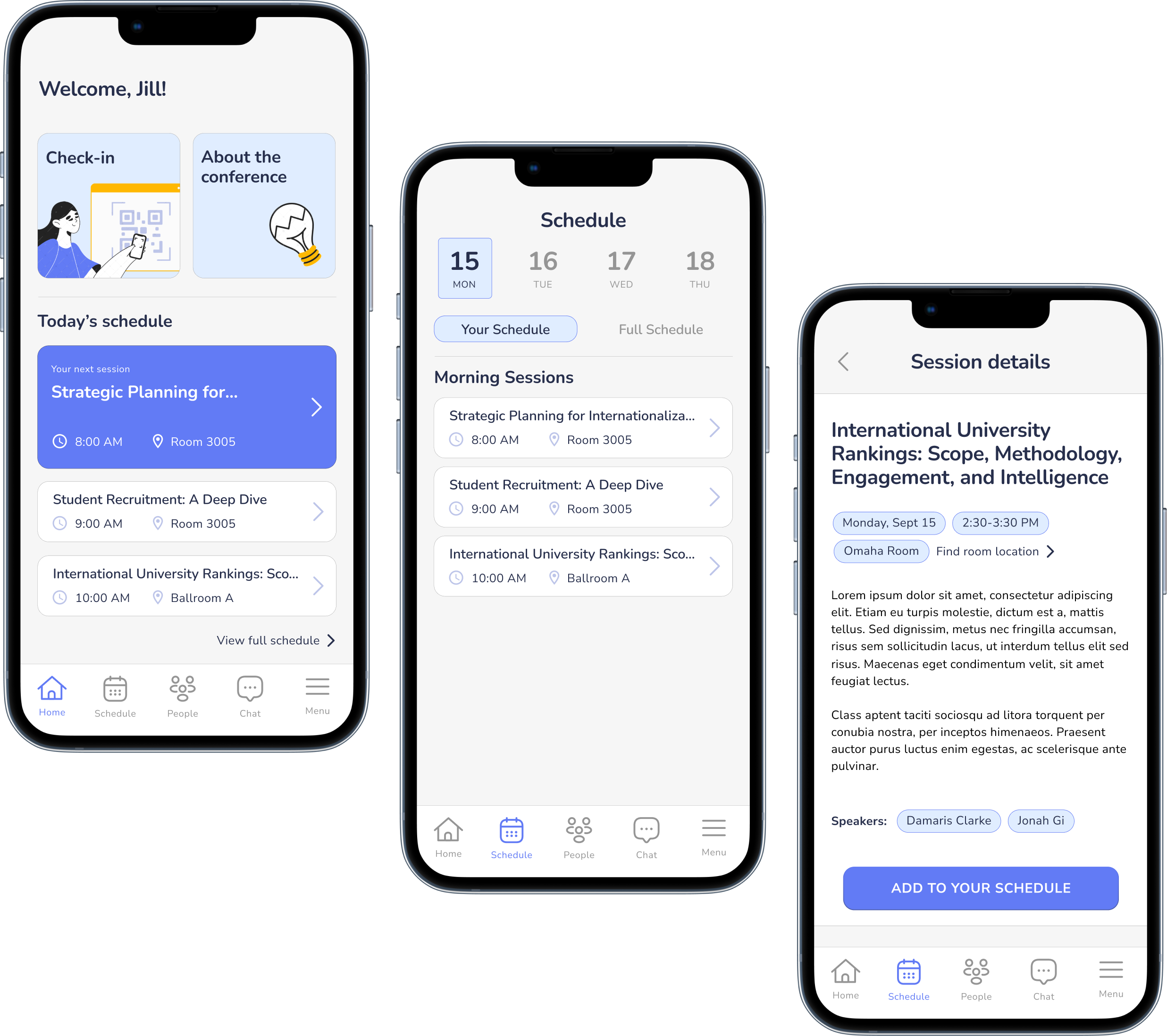
Explore the conference
program and build and manage personalized agendas
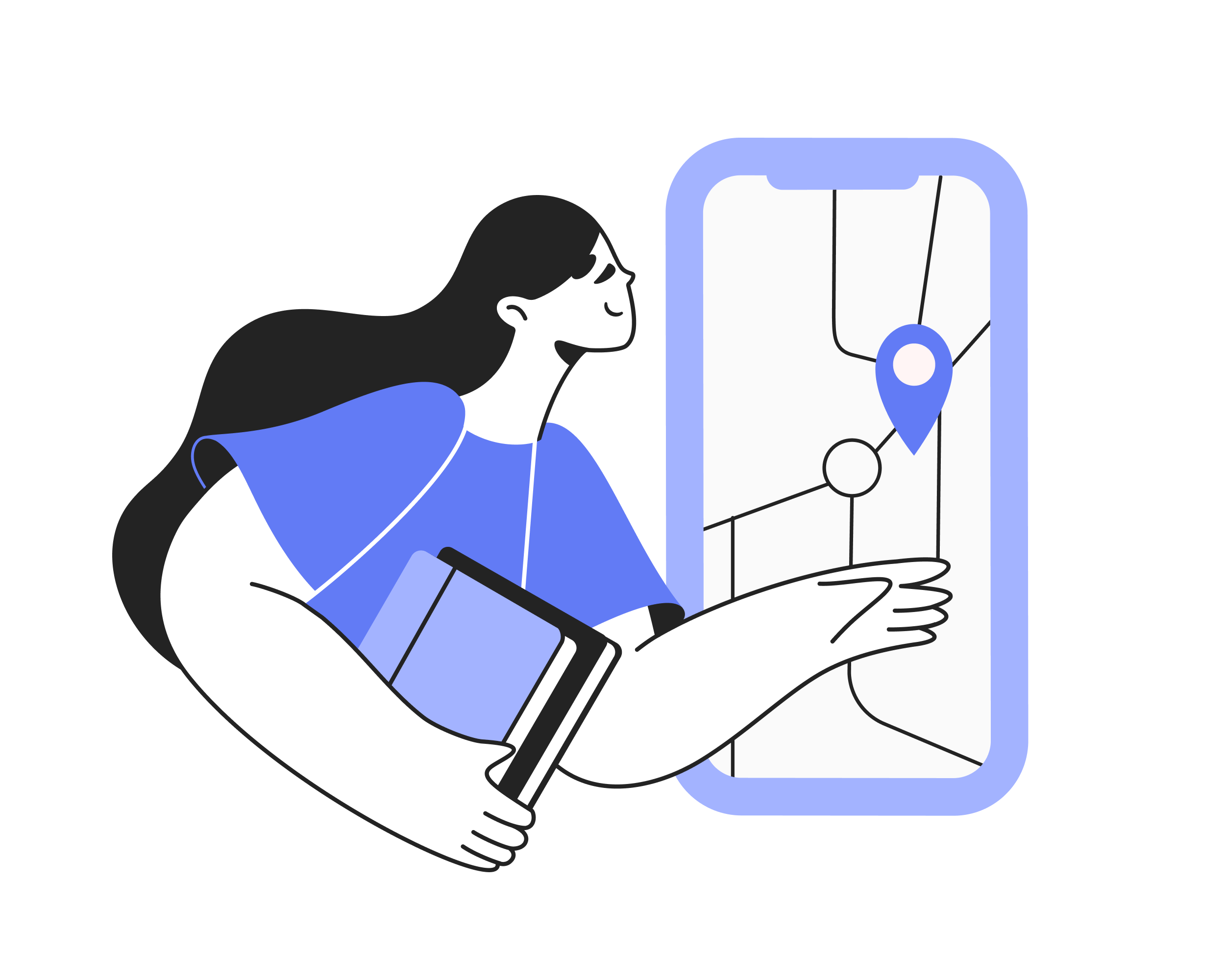
Easily find session rooms and quickly get there


Process
Empathize
User research
Pain points
Ideate
Sketching
Design
Test
Unmoderated
user testing
Define
Persona
User journey
Problem statement
Prototype
Lo-fi wireframes
Hi-fi wireframes
Style guide
Reflect
Identify areas for growth

User
Age: 35-60
Location: North America
Occupation: professionals from corporate organizations
Motivations: build professional connections + stay up to date with sector trends
Digital literacy level: not too familiar with cutting edge technologies, expects simple and straightforward user experience
Pain Points
01
Choosing a session can be time-consuming - there is an overwhelming amount of information.
02
It can be challenging to find relevant professional contacts. There is no streamlined tool for this purpose.
03
It’s a challenge to find a session room as most venues have convoluted floor plans.
User Journey
I found that one of the most common user journeys identified through the interviews didn’t involve a careful and in advance planning of sessions to attend.
Some interviewees admitted that sometimes they try to pick a next concurrent session to go to right before it starts, so they don’t have much time to make this decision.
User goal: Quickly find the most relevant session to keep up with the industry trends.

After mapping the user journey, I started thinking about how I could solve users’ pain points through the app. This user flow shows how a user can explore sessions and add them to their personal schedule.
User Flow

Note: this user flow incorporates the feedback provided by users during the usability testing.
Sketches + Lo-fi Wireframes

Usability Testing
Five out of five unmoderated usability testing participants successfully passed the user flow. However, participants identified some areas for improvement.
01
Problem: Personal schedule should go before the full agenda.
Solution: Swap the order of schedules.
02
Problem: Home Icon doesn’t look obvious.
Solution: Change the home icon.
03
Problem: No alerts during possible time conflicts when managing personal schedule.
Solution: Add a time conflict message to the confirmation page (in case it occurs).
Final Designs
Pain point
Choosing a session can be time-consuming - there is too much information to get through to understand what the session is about.
Solution
Explore the full conference program outlined in an easy-to-navigate layout and quickly choose sessions to attend
Easily view, build and manage personal schedule to always know what’s next on your agenda
Learn more about speakers by going to their profiles
1
Pain point
It can be challenging to find relevant professional contacts. There is no streamlined tool for this purpose.
Solution
Streamline your user search by being able to search delegates and speakers by their name, title or institution
Instantly connect with delegates via the chat function
2
Pain point
It’s a challenge to find a session room as most venues have convoluted floor plans.
Solution
Access room locator through a session page or through main menu
Easily choose your starting point by tapping on the floor plan
Leverage AR technologies to navigate the space more intuitively
3

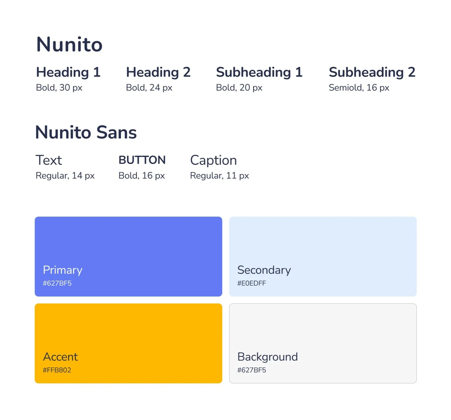
Style Guide
Try It Yourself
Areas for Growth
While working on the app, I learned the importance of understanding the needs and problems of the end user before jumping into the solution stage. I realized I spent more time on visual design and UI than on the foundational user research. If I had more time and resources, I’d do a deeper research by doing a competitive analysis and running screening surveys to identify potential users across different demographics, not just people from a couple of local organizations.
The final designs also have their own limitations and need further improvement on these aspects:
Introducing more accessibility features (i.e. text translation for international guests)
Adding onboarding screens
Elaborating on the AI solution for the room locator + considering limited resources for the solution development