
Snatched plugin
A web plugin that helps viewers to easily detect exact or similar clothing items in TV shows and films for seamless shopping.
Timeline
June–July 2023
Deliverable
Web plugin
Role
Product Designer
Platforms
Figma, Notion, After Effects, Photoshop, Miro, Maze
What is Snatched?
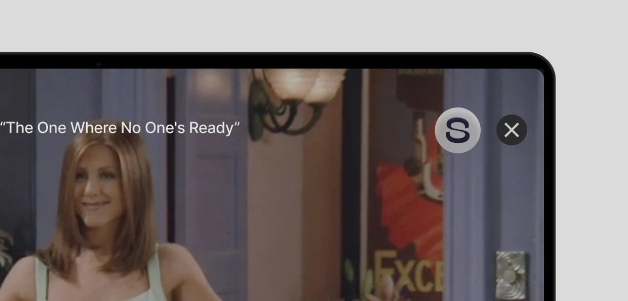
Have you ever watched your favorite show and wondered: "Wow, that’s a cool outfit, where can I get it?". Me too.
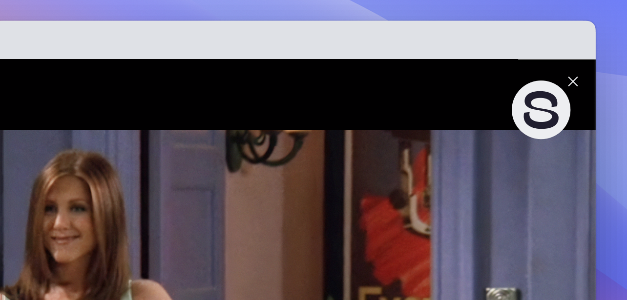
Snatched is an AI-based browser extension that helps streaming service viewers to easily detect exact or similar clothing items in any frame for seamless shopping.
The idea is that users can easily find the products and enhance their shopping experience, and brands gain a direct access to clients interested in their specific product.
Problem
Gen Z and Millennials struggle to find and buy outfits from their favorite shows, while brands are constantly looking for new ways to amplify their product visibility — we need an intuitive solution to bridge this gap.
User opportunity: design an intuitive tool that effortlessly guides users to their desired TV-show outfits.
Business opportunity: earn a commission on referrals for relevant products.
Context
I joined an early-stage start-up consisting of team of 3 developers, 1 marketing specialist and 1 project manager. I was the only product designer, so I had to wear many hats, from designing a visual identity to UX research and design.
Our top objectives were to create a working Minimum Viable Product (MVP) and establish the brand presence to attract potential investors.
-
A web plugin was the quickest and most realistic path to create a MVP aiming to secure early-stage venture capital. We had plans to get integrated with top streaming platforms in the long run.
Despite data showing only 15% of Netflix users prefer laptop streaming, there's notable cross-device usage. Our product, Snatched, targets fashion-conscious young audiences like college students who predominantly use laptops for streaming.

Process
Design
Design goals
Building experiences
Branding + landing
Prove
Usability testing
Integrating feedback
Reflect
Lessons learnt
Define
Problem statement
How might we
Learn
Competitor analysis
User research
User

Fashion enthusiasts
Motivation: Keep up with the latest trends inspired by mass culture.
Goal: Accurately identify and easily buy outfits seen on TV shows.
Pain: Locating specific outfits seen on TV or similar alternatives is hard. Searching for a specific item in Google wastes a lot of time.

Practical people
Motivation: Save time and money by streamlining the shopping process and finding inspiration in favorite content.
Goal: Easily find budget-friendly outfit alternatives.
Pain: Overwhelmed by the endless online choices, too much time and cognitive energy are required for budget-conscious shopping.

Cosplayers
Motivation: Recreate outfits for themed events and conventions.
Goal: Discover distinct clothing items from particular iconic movies & TV shows.
Pain: It’s hard and time-consuming to find exact outfits, or very similar items, especially when original items from TV shows are not available for sale.
Problem
Gen Z and Millennials struggle to find and buy outfits from their favorite shows, while brands are constantly looking for new ways to amplify their product visibility — we need an intuitive solution to bridge this gap.
How might we
How might we create a tool that helps viewers easily identify and purchase clothes they see in movies/shows, while we earn a commission on high-quality referrals of clients for the exact products?
Design Goals
Focused user interface
To seamlessly integrate viewing and browsing user experiences.
Integration with multiple retailers
To provide exact matches & top picks for comparable products and budget-friendly alternativesn emerging niche.
Personalization
To introduce onboarding screens and filtering options to narrow down search results and prioritize user search preferences based on various types of users goals.
Prototype
I designed a high fidelity 'happy path' prototype to give potential investors a glimpse of our vision and attract their attention.
Starting with just a happy path, we risked overlooking alternative user behaviors and edge cases. This could lead to blaming users for potential errors, rather than refining our product, violating Postel’s Law, a UX law, which advocates for a more forgiving interpretation of user actions and adaptable interface.
However, the prototype was instrumental in articulating our vision to potential investors.
While we were engaging with potential investors, I used the Maze tool to conduct a quick unmoderated usability testing for our existing hi-fi prototype. Users were asked to buy a mint dress using the Snatched plugin. I posted the test link to multiple UX and fashion enthusiast communities and 14 users participated in the study.
Usability testing
Just 57% completed the task using the expected path, and only 72.4% succeeded overall.


Common themes identified via affinity diagramming:

User feedback integration
Plug-in icon visibility
Users struggled to find the plugin's launch icon.
I upscaled the plug-in icon for increased visibility.
Confusing categories
Users found the organization and labeling of categories confusing and were disoriented when a single item card led to multiple options.

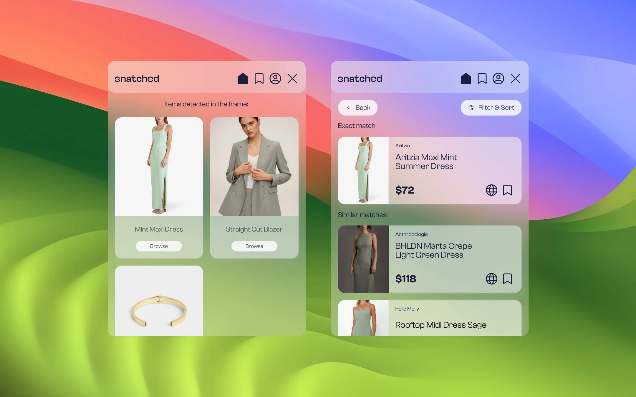
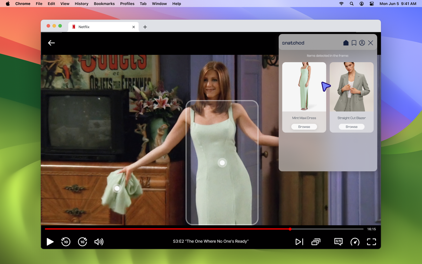
I also added visual cues to highlight detected items in the scene upon hovering over a related card in the Snatched UI, leveraging natural mapping for easier identification.
I also added visual cues to highlight detected items in the scene upon hovering over a related card in the Snatched UI, leveraging natural mapping for easier identification.
Confusing flow
I refined the user journey and accounted for various scenarios, such as when a user is not watching anything or when no items are detected in a frame.


Unclear actions
Due to the prototype's limited action scope, users were unsure about the plugin's full capabilities and the range of possible actions, including using filtering options to find the dress. I added a few features to address this.
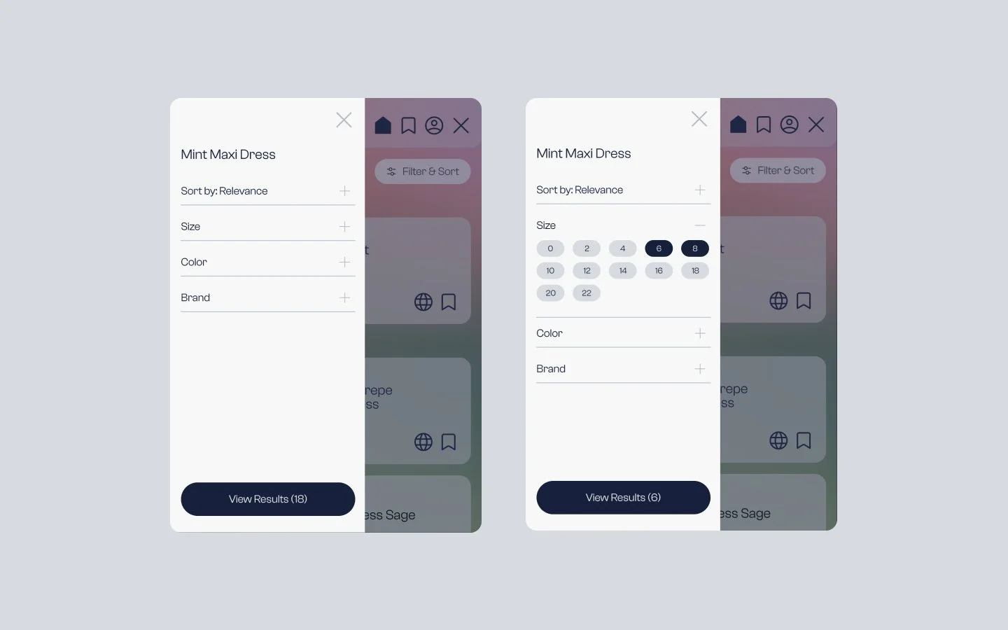
Filtering Flexibility
Users can now sort by relevance or price and filter by size, brand, and color. There is an ability to enable saved preferences for more personalized searches.
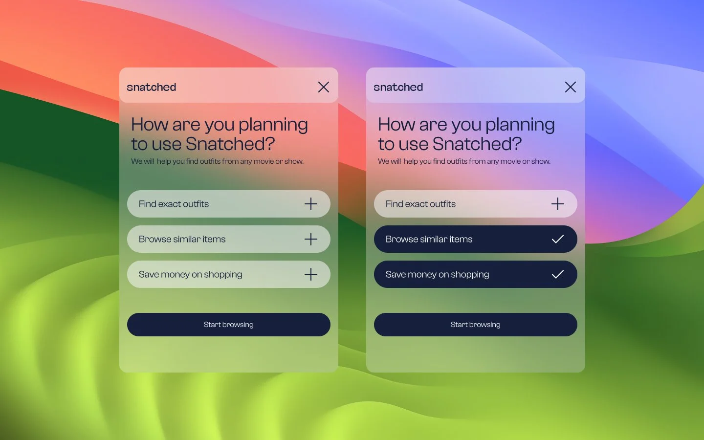
Onboarding
To further personalize search results, I added an ability to outline primary goals of the user during the onboarding process.
Saved tab
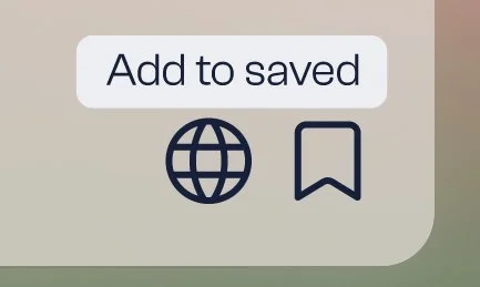
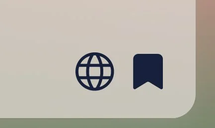
To minimize watching experience interruptions, I introduced a 'Saved' tab where users can bookmark items for later, eliminating in-app purchases. This shift allows direct access to e-commerce sites, reinforcing our focus on the product's essential value: effortless discoverability of items.
Branding

We crafted a brand identity and market our product first. The goal was to spark interest with a landing page and draw in early users to test our MVP.
Pivot
Just as I wrapped up usability studies, our main direct competitor got funding and public attention from an accelerator program. With this change, we realized we had to rethink our approach or find a fresh direction to take Snatched towards. The entire project halted there for now.
We discovered and built our product within a unique niche at the intersection of entertainment and online shopping. A successful launch of MVP could catalyze growth of this underexplored new sector opening up new opportunities for revenue.
Since Snatched wasn’t released, we couldn’t directly measure its success. However, had it been launched, the key metrics I’d focus on to measure it would be
Measuring impact
Onboarding completion rates
To indicate how effective the onboarding process is and how easy and engaging users find to get started with Snatched.
Adoption rates
To see how many users installed and used Snatched, especially since it's a new product in an emerging niche.
Conversion & click-through rates
To determine user’s interest in the product and level of consideration for buying discovered items, hence the accuracy of our suggestions.
Lessons learnt
Stay resourceful
Working on an early-stage start-up requires fast iteration and a focus on impact/value to the business. This requires the UX designer to wear multiple hats, rely on heuristics, quick prototyping and user testing. In this environment, it’s vital to be able to make right decisions about where to invest limited resources for maximum impact, and where the right compromises can accelerate the project’s success.
Test your ideas before refining visuals
Creating a high-fidelity prototype helped us pitch to investors, but it delayed critical user testing. This led to some features proving unviable when eventually tested. Going forward, I'd prioritize early validation of our designs to ensure we're on the right track before crafting pitch materials.
Communication is key (as always)
In our start-up's early days meetings often felt like laid-back conversations with no clear goals in mind. We missed the chance to align by not asking key questions like "Why are we doing this instead of that?" and "What's next?" A focus on clearer communication and the unifying goal would have unified our vision by clarifying assumptions and accelerated our progress toward a quicker implementation of a stronger MVP.
This project was a great experience that threw me into the realities of an early stage start-up, helping me identify my areas for growth and teaching me to think on my fit, working under pressure and zooming out to keep in mind the design problem we were trying to solve.